When creating graphs, we’re usually most concerned with what happens near the center of our displays, as this is where most of the important information is generally held. But sometimes, either for aesthetics or clarity, we want to adjust what’s outside of the box – in the margins, labels or tick marks. The par() function offers several ways to do this and I’ll discuss two that deal primarily with spatial orientation – rather than content – below.
The oma, omd, and omi options
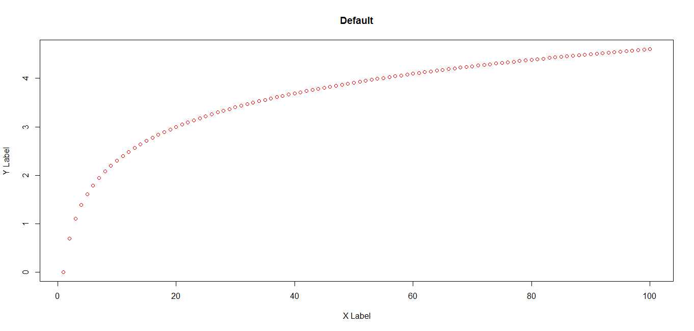
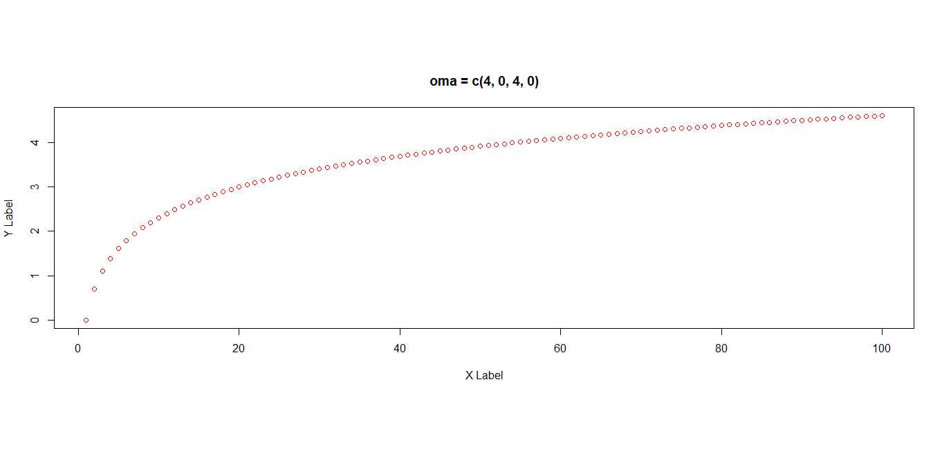
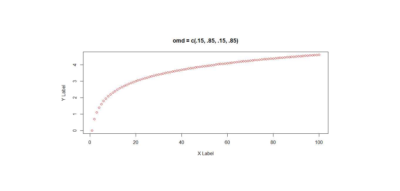
To control the width of the outer margins of your graph (the empty sections outside of the axes and labels) use either the oma, omd, or omi option of the par() function. All three of these options have the same effect and differ only in the units used to define the parameter. oma defines the space in lines, omd as a fraction of the device region, and omi specifies the size in inches. oma and omi take a four item vector where position one sets the bottom margin, position two the left margin, position three the top margin and position four the right margin. omd uses a four item vector where positions one and three define, in percentages of the device region, the starting points of the x and y axes, respectively, while positions two and four define the end points. Because these options all effect the same graph space, changing one also changes the remaining two. A few examples of code and the charts they produce are shown below. To help illustrate the different margin sizes, the blue area indicates the dimensions of the device display:
# generate some data
x<-log(seq(1:100))

# par oma r - oma, omd, and omi defaults
par()

>
> $oma
>[1] 0 0 0 0
>gt;
>gt;$omd
>[1] 0 1 0 1
>
>$omi
>[1] 0 0 0 0
>...

# plot using default margin settings
plot(x,pch=1, col = "red", ylab = "Y Label", xlab = "X Label")
title("Default")
# add four lines to bottom and top margins
par(oma = c(4, 0, 4, 0))
plot(x, pch=1, col = "red", ylab = "Y Label", xlab = "X Label")
title("oma = c(4, 0, 4, 0)")
# change via omd
par(omd = c(.15, .85, .15, .85))
plot(x, pch=1, col = "red", ylab = "Y Label", xlab = "X Label")
title("omd = c(.15, .85, .15, .85)")# because oma, omd, and omi all affect the same graph space
# this doesn't make sense
par(omi = c(0, 0, 0, 0), omd = c(.10, .90, .10, .90))
# reset oma, omd, and omi to default by changing omi
par(omi = c(0, 0, 0, 0))The mgp option
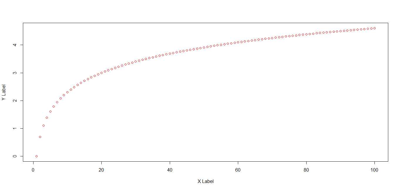
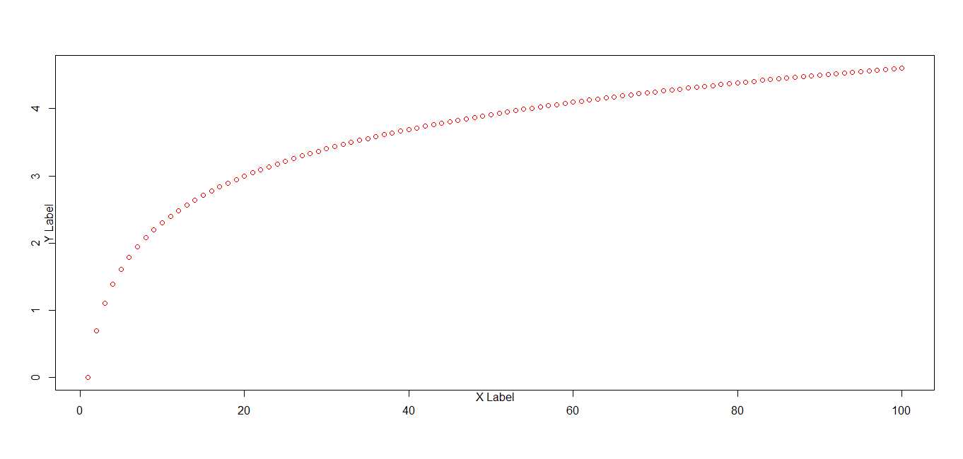
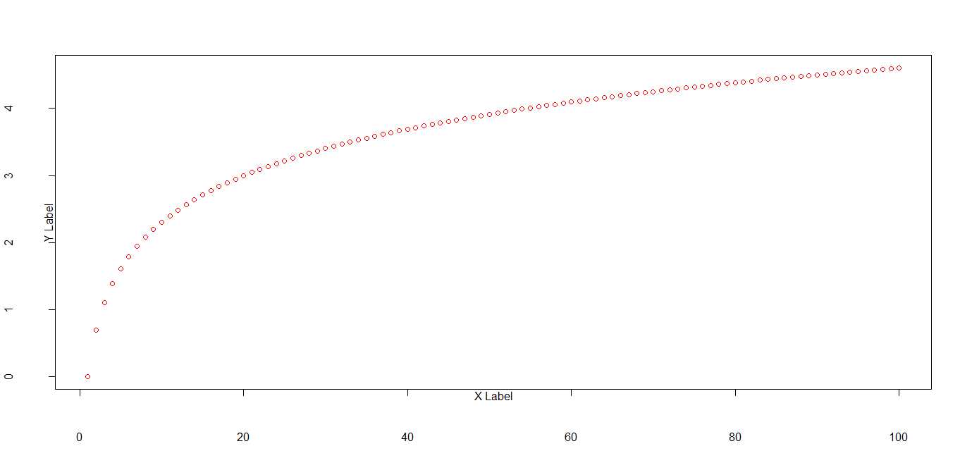
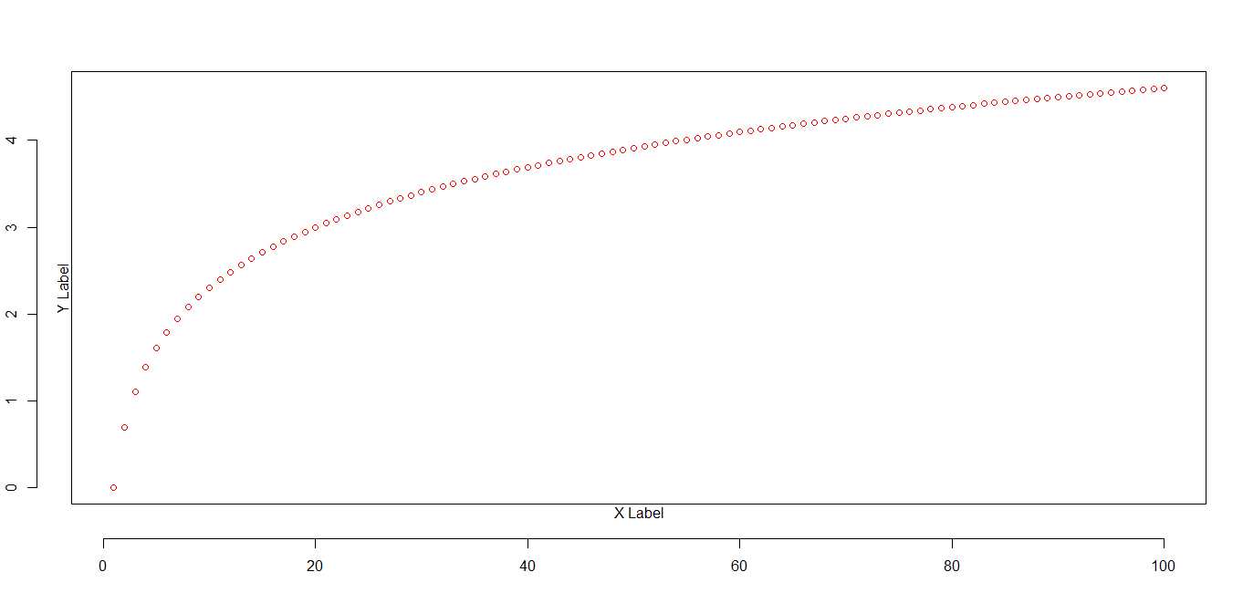
In addition to changing the margin size of your charts, you may also want to change the way axes and labels are spatially arranged. One method of doing so is the mgp parameter option. The mgp setting is defined by a three item vector wherein the first value represents the distance of the axis labels or titles from the axes, the second value is the distance of the tick mark labels from the axes, and the third is the distance of the tick mark symbols from the axes. As with the oma option discussed above, the distances are given in line widths. The defaults for the mgp setting are c(3, 1, 0). The examples below illustrate the effects of changing the various mgp values. Note: the mgp.axis() function in the Hmisc package can be used to change these settings for each axis individually.
# r plot mgp - mgp default settings
plot(x, pch=1, col = "red", ylab = "Y Label", xlab = "X Label")
# par mgp r - r axis label position
# move labels close to axes
par(mgp = c(0, 1, 0))
plot(x, pch=1, col = "red", ylab = "Y Label", xlab = "X Label")# move tick labels out
# reverse to move tick labels closer to axis
par(mgp = c(0, 3, 0))
plot(x, pch=1, col = "red", ylab = "Y Label", xlab = "X Label")# move tick lines out
par(mgp = c(0, 3, 2))
plot(x, pch=1, col = "red", ylab = "Y Label", xlab = "X Label")Summary
The oma, omd, omi, and mgp parameter settings can be useful in defining and adjusting the outer regions of your charts. To arrange and size multiple graphing areas you may also find other par() settings such as fig, fin, or layout helpful.
This article was one of several this blog has done on graphics and visualization; you may also be interested in:
- Introduction to building animated graphs using R
- Tricks for Plotting multiple graphs on the same panel
- Automated graphing and analysis using open data API’s
Other related topics:
- Web Scraping when data isn’t available via an API wrapper:
- RCurl (simple)
- Rvest (CSS selector targeting)
- JSON based scraping (AJAX sites, API’s)
This answers my question, it was very helpful.
Andrew in Boston
Excellent Introduction to controlling margins, and axis labels. I really appreciate the fact that you included the accompanying diagrams which makes it so much easier to understand your codes. Thank you for posting these notes!
YG
Hello! Your post is very useful, it is exactly what
I was looking for. And as usual diagrams make things easier and obvious. Well done!
Introductory documentation prepared to control the width of the outer margins of your graph by proper utilizing oma and mgp is an excellent addition to this blog that allows users to provide comprehensive details about the application used in this graphical concept.Now i am quite excited to learn from your tutorial.
THANKS! You just saved my pollen diagram (some taxa were outside the frame)!